If you’re building a mobile app, it should simple enough for a drunk person to use.
Believe it or not, that’s actually not a bad philosophy.
Indeed, Drunk User Testing can show you how a website might look under the influence. And over at The User is Drunk, you can pay to get your website reviewed by someone who’s ‘very drunk’.
Well, it’s one way to make a bit of cash.
This app really is for drunk people
Of course, some apps have to consider users who really might be drunk. On Friday and Saturday evenings in London, I reckon a significant proportion of Citymapper and Uber users will have had a shandy or three.
And if you’re creating an app for a beer festival, of course there will be alcohol involved during the user journey.
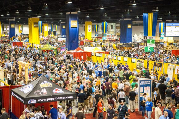
Step forward My GABF, a mobile app designed to accompany the Great American Beer Festival. This annual celebration of beer from the USA takes place in Denver. I visited in September and it’s enormous.
With 3,500 beers available from 750 breweries, you can only sample a fraction of what’s on offer.
The My GABF app aims to help you navigate this rich choice of beer. And it does an excellent job.
What makes My GABF so good?
On the face of it, My GABF offers exactly the features you’d expect from an event app.
There’s a list of beers and breweries. There’s a map. And there’s a section to keep you up-to-date with festival news, like which beers have won awards.
Although the features have clearly been thought through, it’s the genuinely simple, intuitive experience that makes this app stand out.
Quite simply, My GABF makes it easy to get the information you need: before, during and after the event.
Focused navigation items
When you first open the app, a brief tutorial shows you the main features. It’s a welcome start, but the focused options at the bottom of the screen mean the app is unlikely to intimidate, even if you don’t pay attention at the beginning:
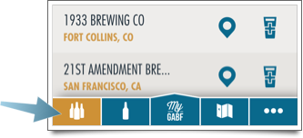
The first four icons let you jump to key features:
- See full lists of breweries and beers
- Create your own shortlists, which live in ‘My GABF’
- Pull up a map of the vast festival venue
To minimise clutter, less-important options — such as news — are hidden in a separate section.
Several ways to find beers you like
My GABF maintains its focus throughout, with screens that are universally uncluttered and easy to understand.
But ultimately, the Great American Beer Festival is about discovering new beers. The app mirrors this by giving you several ways to explore what’s on offer.
By brewery:
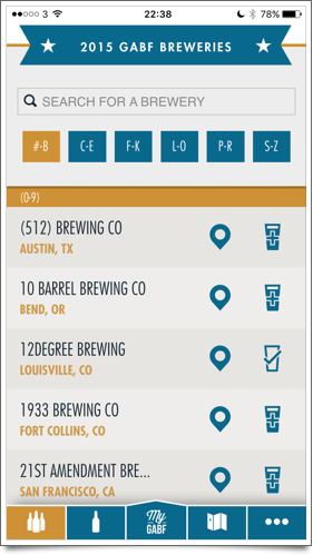
When viewing the full list of breweries, you can choose which to add to your shortlist by tapping the glass icon. Or tap the brewery name to choose from the available beers.
By beer style:
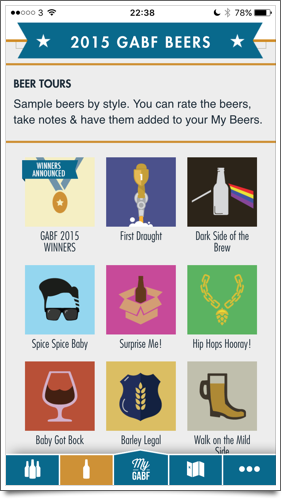
The app provides a bunch of ‘beer tours’ that group similar drinks. So if you’re a fan of double-hopped or sour beers, you can track them down more easily.
By location:
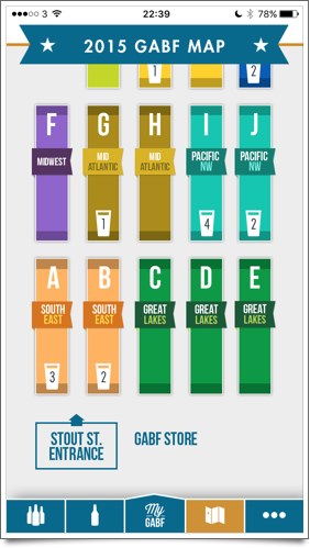
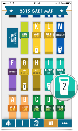
You can explore the festival map, tapping each sections of the floor plan to reveal the breweries there. This means you can quickly find out what’s around you at any time.
You can also search for specific beer names, or simply scroll through the list of beers looking for ones that sound interesting.
Making your shortlist count
There’s one other way in which My GABF works hard to keep you coming back to the app. As you explore breweries and beers in advance of the festival, you can select the ones you’re interested in, building up a list.
At the festival, the app helps you try as many of those beers as possible. It does this by flagging the beers on your list in context.
Just tap ‘My GABF’ and you see a full list of your beers and breweries. To make sure you can actually find each beer in the sprawling festival venue, you can jump straight to its location on the map.
And if you’re prefer to follow your own path, the floor plan shows how many of your target beers are in each section:
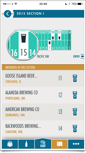
When you drill down into each section, you see the exact locations of your beers:
You also see your shortlisted beers highlighted within the beer tours.
It works just fine in a crowd
If you connect My GABF to Facebook, the app saves your shortlist and tasting notes online. This means they’ll be safe even if you lose your phone or uninstall the app.
But once the initial list of breweries and beers has been downloaded, this app doesn’t need a reliable data connection. That’s really important, because it’s hard to guarantee a good connection in a busy venue.
What’s more, My GABF responds just as quickly no matter if the connection is fast, slow, or non-existent. In other words: as long as your battery isn’t flat, it’ll work.
So, when you add it up, you have a killer combination:
- A focused app, with exceptionally clear navigation and several logical ways to discover new beers.
- Straightforward personalisation, so it’s easy to save and view the things that are important to you.
- Guaranteed reliability, which means you can always use the app even if your data connection is flaky.
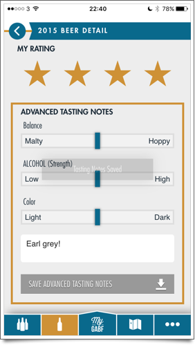
Oh, and did I mention you can enter your own tasting notes, then save for future reference or even export as a CSV file?
See, I told you it was good. Genuinely one of the best apps I’ve discovered this year. And not just because it’s about beer.
Top photo © Brewers Association
Rather unfairly, I tend to be a bit wary of the word ‘banter’. It conjures up images of the none-too-subtle blokey chat popularised by magazines like Loaded and TV shows like Sky’s Soccer AM.
Still, I’m glad I didn’t let the name put me off attending Design+Banter earlier this month, a London event organised by Gearóid O’Rourke and Sam Willis.
The evening brought together around 150 web professionals to drink free beer (thanks guys!) and listen to three guest speakers talk about design concepts, projects and ideas.
Of the three talks, the one that really stuck with me came from Gil Wedam, lead designer at Citymapper.
Designing Citymapper
If you’re not familiar with Citymapper, it’s an astonishingly good app that helps you find your way around major cities like London, Barcelona, New York and Berlin.
Its elegantly-simple screens hide a wealth of functions and some playful touches, which have helped it garner a bucketload of five-star reviews.
Gil began his talk by explaining how Citymapper became feasible when several elements aligned:
- Smart phones had become widespread, so any such app would have a big potential user base
- City authorities were beginning to open up their transport data to third parties
- Nobody else had created a really good, comprehensive app covering all modes of transport
Obsessed with people
More than anything, Citymapper’s approach to design puts it ahead of competing apps. And as Gil explained, their philosophy is to always ‘design for humans’.
Sounds obvious, right? Well, the Citymapper team go to significant lengths to put people at the centre of the app, at every stage.
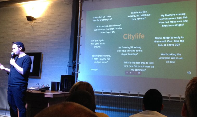
They begin with a list of specific questions that the designers want the app to solve. While other apps might say ‘get me from A to B’, the Citymapper team aims to get right under the skin of potential users:
- I kinda feel like walking, do I still have time for that?
- It’s freezing! How long do I have to stand at this stupid bus stop?
- I’m late. Again. Any Boris bikes around?
An illuminating slide at the start of the start of the presentation (pictured above) revealed how these — and other — questions aim to reflect real-world user situations.
This obsession with human situations manifests itself in every aspect of the app. But the results screen is perhaps the most obvious place to see it:
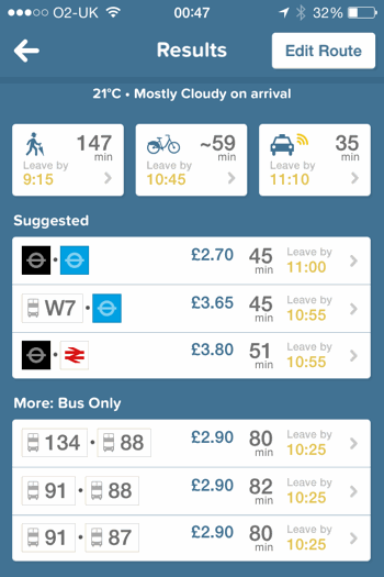
It successfully crams a huge amount of information into a small space, giving you all the details you need to make a decision about which mode of transport to use.
Crucially, it doesn’t tell you the ‘best’ option based on some narrow criteria. It gives you choice, letting you decide for yourself.
That shows respect for the user by keeping them in the driving seat. It’s open data of a sort, because it doesn’t try to second-guess what you want to see.
Design begins with words
Then there’s the language. As Gil remarked early in the presentation, ‘design begins with words’.
At Citymapper, they spend lots of time finding out what people call things, aiming to use the same language in the app.
It’s a simple principle that works across all sorts of content — from conversion-focused sales copy to microcopy on forms and, yes, in-app content.
Using the language that your users speak means they’ll understand you. It shows empathy. And it makes it easier to connect with them during the short period you have their attention.
Gil’s team understands this. That’s why Citymapper says ‘get me somewhere’, not ‘search routes’ or ‘find journey’. That’s why it says ‘thinking’ while searching for results, instead of ‘searching’ or ‘processing’.
And that’s why Citymapper is by far and away the most enjoyably useful transit app out there.
Citymapper is available for iPhone and Android.
Information about the next Design+Banter event should be posted online in due course.
I first launched this website in early 2007, getting started with a blog post about contracting in large companies that’s surprisingly relevant even seven years on.
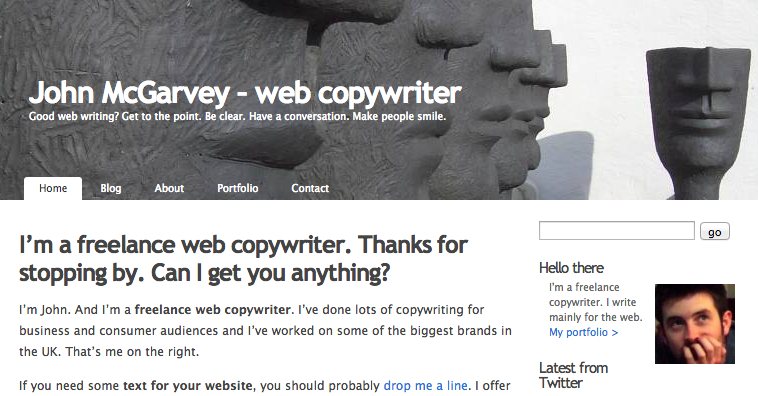
To be honest, ‘launched’ is a grand term for a site I threw together in a couple of hours. It was built on the versatile WordPress platform and I created it after deciding I needed some kind of online presence.
Low effort, decent rewards
That low-effort site served me well. When I decided to go freelance in 2008, I just had to make some minor changes. For a long time, it looked much like the screenshot above.
Those changes seemed to work. The site achieved decent search rankings for some relevant terms and even brought in a few clients.
But as time went by, my trusty web presence became something of an embarrassment.
When I first gave a talk espousing the value of good design and explaining that copywriting and web design are two sides of the same thing, it seemed ridiculous that my own site was built on a dated, out-of-the-box template.
A classic case of ‘do as I say, not do as I do’.
Enough was enough
A mere two years later, I decided enough was enough and started looking at the options for building a new site.
I considered using something like BaseKit to do it myself, or developing a new WordPress site to boost my technical skills. After all, in the dim and distant past I was good enough at coding to get a degree in Computer Science.
But I dismissed those ideas swiftly. I believe in good design and I respect the skills of designers who’ve spent years learning their craft.
I wanted to work with someone who had expertise, rather than cobbling something together.
Finding the right team
I ended up approaching several designers, any of whom I’d have happily worked with.
I eventually settled on Carabi + Co, a group of web professionals I’ve been part of for a couple of years.
Much hard work later and I’ve ended up with the site you see in front of you. Here’s who did what:
Oh, and I did the content, obviously.
That, in brief, is how I got here. Finally, I have a site that a web writer can be proud of.
Watch this space for a more detailed post about the process we went through to actually build this site.
