Some locations provide rich pickings when it comes to content strategy done badly. I’ve highlighted planes, trains and automobiles before. But in the last few years, a new poster-child for poor content strategy has emerged.
Have you ever paid attention to the content on the screen of the self-checkout machines in your local supermarket?
They are, almost universally, terrible. Even the simplest of transactions can be peppered with confusing instructions, unhelpful prompts and hard-to-decipher errors.
For example, if we assume that a bagging area is for bags, how can you really classify the bag I’ve put there as a ‘surprising item’? (Morrisons, I’m looking at you.)
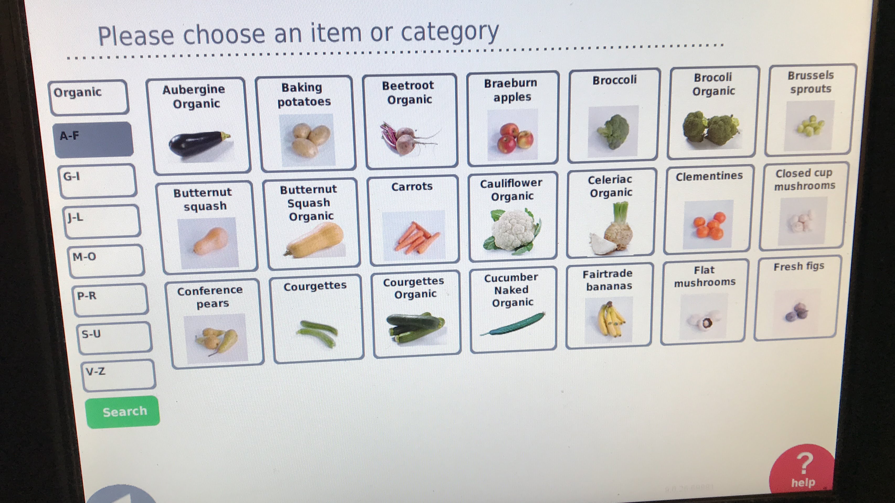
Here’s an example from my local Co-Op. They only sell Fairtrade bananas. That’s no bad thing, but they’re filed under ‘f’ for ‘Fairtrade’ instead of ‘b’ for bananas, which catches me out every time.
And that’s just the start. Even on this single screen, you can see many issues with the content strategy:
- Why is the capitalisation of ‘Butternut squash’ different to ‘Butternut Squash Organic’? What’s so special about the organic option that it merits the initial capitals?
- They’ve spelt ‘broccoli’ wrong, but only for the organic option. I can see how that combination of letters might catch you out, but you’d think a big supermarket chain would get it right.
- Although every single item on this screen is an item of fresh fruit and veg, the figs are the only item specifically identified as ‘fresh’.
- There’s a weird mix of the singular and plural. I can select ‘aubergine’ (single), but ‘baking potatoes’ (plural). What happens if I try to buy just one potato?
None of these things is a disaster. You can still figure out this screen, find the right product and complete your purchase.
But it’s a mess. It’s inconsistent, jarring and unpolished. It feels like a first draft, not like something you’d put in front of your customers. If a cashier serving people in person took the same slapdash approach, customers would leave confused and dissatisfied.
The (lack of) content strategy on this screen makes it harder to navigate – especially if you’re in a busy supermarket with people waiting in line behind you.
Some simple tweaks would improve it, but baking in content strategy from the start would have been better. Because if you can’t find what you’re trying to buy, why use a supermarket self-checkout at all?
Much as I love travelling by train, experience has taught me that UK rail journeys can be fraught with difficulty.
I’ve documented some of my concerns before, like ridiculous ticket options and mobile email woes.
But on Friday, I found it near-impossible to book a ticket at all. Let me explain…
The First Great Western backstory
The train company operating services from London Paddington to Bristol, Bath and the west of England was, until recently, called First Great Western.
First Great Western was such a hit that, at the height of its notoriety, it spawned several critical websites and was even subjected to a strike by its passengers.
The First Great Western moniker was retired earlier this year and the company renamed itself Great Western Railway. Given the brand’s chequered history, this decision probably makes sense.
The elegant new livery looks fresh and echoes the railway’s history. The company’s website grandly proclaims that it has ‘given the West back its Great Western Railway’.
When buying a ticket is a challenge
So far, so pretty. But the road to poor customer experiences is paved with good intentions.
Today I wanted to book a simple journey: a day return from London to Bristol. Should be easy, right?
Wrong.
First, I tried the new GWR website. Repeated attempts to book saw me stymied by an unhelpful, generic error message:
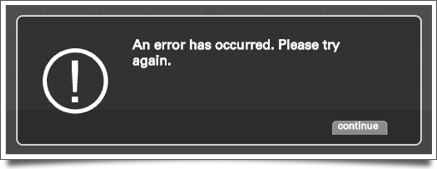
Errors are always frustrating. They obstruct your progress and prevent you achieving your goals. But errors like this are particularly irritating because they don’t explain what’s happened, nor make any attempt to apologise.
A simple ‘sorry’ — no matter how automated and insincere — is better than none at all.
What’s more, when presented with vague errors, many people blame themselves — even when the problem really isn’t with them.
Irritated by this error and somewhat lacking in patience, I turned to the company’s iPhone app. This proclaims it can store mobile tickets, so I was briefly excited at the prospect of being able to travel without a paper ticket.
My enthusiasm took a hit when my attempts to view ticket prices resulted in another supremely unhelpful message:
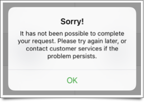
On the plus side, this one at least says sorry. But, again, it doesn’t tell me the cause of the error. Nor does it provide any contact details for customer services.
After seeing this 3 times, I’d had it. So I visited another train ticketing website and booked my tickets there instead.
Fresh new start, same old story?
For GWR this whole experience feels like a missed opportunity. It was my first real interaction with the company since the rebrand, and a good opportunity to impress me.
Instead, I left wondering if anything has really changed underneath the pretty new livery.
Come on, GWR. Give some thought to your customer experience, as well as to what colour you paint your trains.
If you’re building a mobile app, it should simple enough for a drunk person to use.
Believe it or not, that’s actually not a bad philosophy.
Indeed, Drunk User Testing can show you how a website might look under the influence. And over at The User is Drunk, you can pay to get your website reviewed by someone who’s ‘very drunk’.
Well, it’s one way to make a bit of cash.
This app really is for drunk people
Of course, some apps have to consider users who really might be drunk. On Friday and Saturday evenings in London, I reckon a significant proportion of Citymapper and Uber users will have had a shandy or three.
And if you’re creating an app for a beer festival, of course there will be alcohol involved during the user journey.
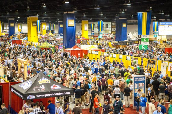
Step forward My GABF, a mobile app designed to accompany the Great American Beer Festival. This annual celebration of beer from the USA takes place in Denver. I visited in September and it’s enormous.
With 3,500 beers available from 750 breweries, you can only sample a fraction of what’s on offer.
The My GABF app aims to help you navigate this rich choice of beer. And it does an excellent job.
What makes My GABF so good?
On the face of it, My GABF offers exactly the features you’d expect from an event app.
There’s a list of beers and breweries. There’s a map. And there’s a section to keep you up-to-date with festival news, like which beers have won awards.
Although the features have clearly been thought through, it’s the genuinely simple, intuitive experience that makes this app stand out.
Quite simply, My GABF makes it easy to get the information you need: before, during and after the event.
Focused navigation items
When you first open the app, a brief tutorial shows you the main features. It’s a welcome start, but the focused options at the bottom of the screen mean the app is unlikely to intimidate, even if you don’t pay attention at the beginning:
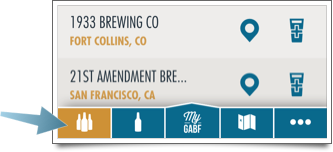
The first four icons let you jump to key features:
- See full lists of breweries and beers
- Create your own shortlists, which live in ‘My GABF’
- Pull up a map of the vast festival venue
To minimise clutter, less-important options — such as news — are hidden in a separate section.
Several ways to find beers you like
My GABF maintains its focus throughout, with screens that are universally uncluttered and easy to understand.
But ultimately, the Great American Beer Festival is about discovering new beers. The app mirrors this by giving you several ways to explore what’s on offer.
By brewery:
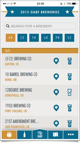
When viewing the full list of breweries, you can choose which to add to your shortlist by tapping the glass icon. Or tap the brewery name to choose from the available beers.
By beer style:
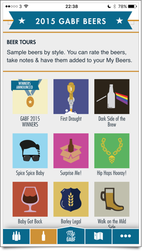
The app provides a bunch of ‘beer tours’ that group similar drinks. So if you’re a fan of double-hopped or sour beers, you can track them down more easily.
By location:
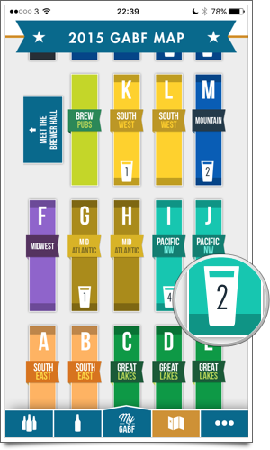
You can explore the festival map, tapping each sections of the floor plan to reveal the breweries there. This means you can quickly find out what’s around you at any time.
You can also search for specific beer names, or simply scroll through the list of beers looking for ones that sound interesting.
Making your shortlist count
There’s one other way in which My GABF works hard to keep you coming back to the app. As you explore breweries and beers in advance of the festival, you can select the ones you’re interested in, building up a list.
At the festival, the app helps you try as many of those beers as possible. It does this by flagging the beers on your list in context.
Just tap ‘My GABF’ and you see a full list of your beers and breweries. To make sure you can actually find each beer in the sprawling festival venue, you can jump straight to its location on the map.
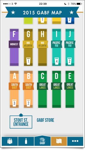
And if you’re prefer to follow your own path, the floor plan shows how many of your target beers are in each section:
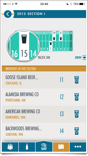
When you drill down into each section, you see the exact locations of your beers:
You also see your shortlisted beers highlighted within the beer tours.
It works just fine in a crowd
If you connect My GABF to Facebook, the app saves your shortlist and tasting notes online. This means they’ll be safe even if you lose your phone or uninstall the app.
But once the initial list of breweries and beers has been downloaded, this app doesn’t need a reliable data connection. That’s really important, because it’s hard to guarantee a good connection in a busy venue.
What’s more, My GABF responds just as quickly no matter if the connection is fast, slow, or non-existent. In other words: as long as your battery isn’t flat, it’ll work.
So, when you add it up, you have a killer combination:
- A focused app, with exceptionally clear navigation and several logical ways to discover new beers.
- Straightforward personalisation, so it’s easy to save and view the things that are important to you.
- Guaranteed reliability, which means you can always use the app even if your data connection is flaky.
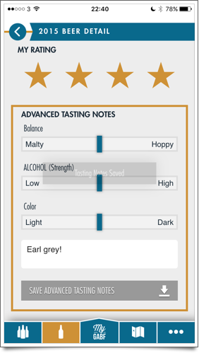
Oh, and did I mention you can enter your own tasting notes, then save for future reference or even export as a CSV file?
See, I told you it was good. Genuinely one of the best apps I’ve discovered this year. And not just because it’s about beer.
Top photo © Brewers Association