
According to Citymapper, design begins with words
Rather unfairly, I tend to be a bit wary of the word ‘banter’. It conjures up images of the none-too-subtle blokey chat popularised by magazines like Loaded and TV shows like Sky’s Soccer AM.
Still, I’m glad I didn’t let the name put me off attending Design+Banter earlier this month, a London event organised by Gearóid O’Rourke and Sam Willis.
The evening brought together around 150 web professionals to drink free beer (thanks guys!) and listen to three guest speakers talk about design concepts, projects and ideas.
Of the three talks, the one that really stuck with me came from Gil Wedam, lead designer at Citymapper.
Designing Citymapper
If you’re not familiar with Citymapper, it’s an astonishingly good app that helps you find your way around major cities like London, Barcelona, New York and Berlin.
Its elegantly-simple screens hide a wealth of functions and some playful touches, which have helped it garner a bucketload of five-star reviews.
Gil began his talk by explaining how Citymapper became feasible when several elements aligned:
- Smart phones had become widespread, so any such app would have a big potential user base
- City authorities were beginning to open up their transport data to third parties
- Nobody else had created a really good, comprehensive app covering all modes of transport
Obsessed with people
More than anything, Citymapper’s approach to design puts it ahead of competing apps. And as Gil explained, their philosophy is to always ‘design for humans’.
Sounds obvious, right? Well, the Citymapper team go to significant lengths to put people at the centre of the app, at every stage.
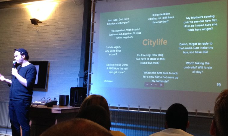
They begin with a list of specific questions that the designers want the app to solve. While other apps might say ‘get me from A to B’, the Citymapper team aims to get right under the skin of potential users:
- I kinda feel like walking, do I still have time for that?
- It’s freezing! How long do I have to stand at this stupid bus stop?
- I’m late. Again. Any Boris bikes around?
An illuminating slide at the start of the start of the presentation (pictured above) revealed how these — and other — questions aim to reflect real-world user situations.
This obsession with human situations manifests itself in every aspect of the app. But the results screen is perhaps the most obvious place to see it:
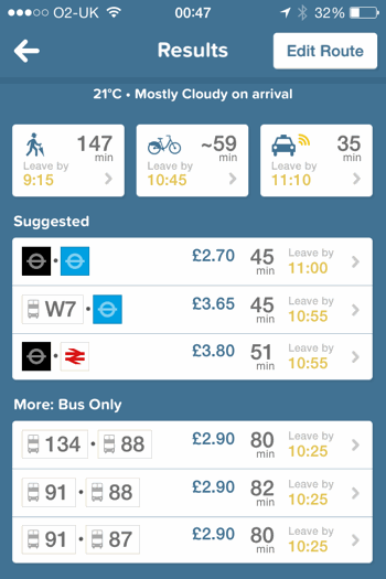
It successfully crams a huge amount of information into a small space, giving you all the details you need to make a decision about which mode of transport to use.
Crucially, it doesn’t tell you the ‘best’ option based on some narrow criteria. It gives you choice, letting you decide for yourself.
That shows respect for the user by keeping them in the driving seat. It’s open data of a sort, because it doesn’t try to second-guess what you want to see.
Design begins with words
Then there’s the language. As Gil remarked early in the presentation, ‘design begins with words’.
At Citymapper, they spend lots of time finding out what people call things, aiming to use the same language in the app.
It’s a simple principle that works across all sorts of content — from conversion-focused sales copy to microcopy on forms and, yes, in-app content.
Using the language that your users speak means they’ll understand you. It shows empathy. And it makes it easier to connect with them during the short period you have their attention.
Gil’s team understands this. That’s why Citymapper says ‘get me somewhere’, not ‘search routes’ or ‘find journey’. That’s why it says ‘thinking’ while searching for results, instead of ‘searching’ or ‘processing’.
And that’s why Citymapper is by far and away the most enjoyably useful transit app out there.
Citymapper is available for iPhone and Android.
Information about the next Design+Banter event should be posted online in due course.


 No matter whether you’re a professional web copywriter (like me) or a professional something-else (maybe that’s you), we all have to edit our own work from time-to-time.