I’ve said before that I believe copywriters and content creators do their best work when they collaborate closely with designers.
Quite simply, design and content are interdependent. You only get the best final product when you consider them together.
One tool that makes this easier is Balsamiq. It’s a straightforward-yet-powerful piece of software that lets you create rough layouts and low-fidelity wireframes very quickly. Here’s an example:
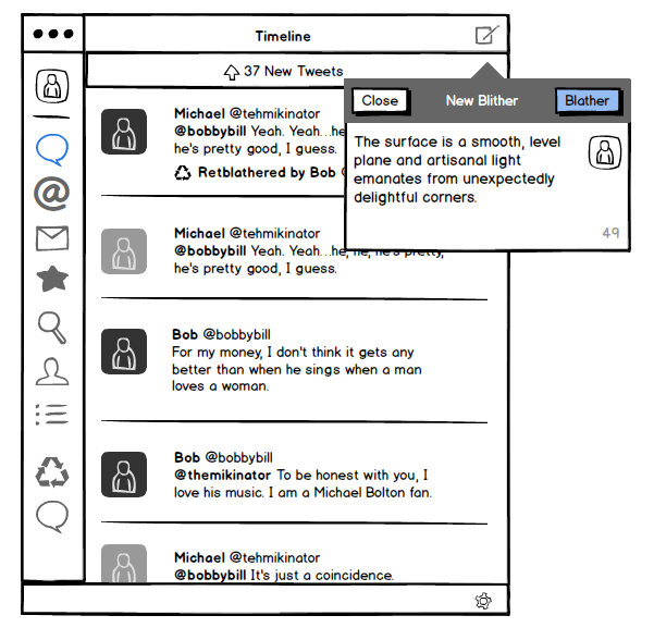
You can choose from a wide range of design elements, drop them onto your page and arrange as necessary. It’s impressively fast and easy to get the hang of.
Bridging the design gap
Because Balsamiq is so speedy, it can help bridge the gap between writers and designers without introducing unacceptable overheads.
I use it in three main ways:
1. To indicate the relative prominence of content
When I’m working on a content plan, sketching web pages in Balsamiq is a good way to show what content elements should feature and how important they are.
If the final content plan explains the ins and outs of each page, the accompanying Balsamiq mockups provide a quick, visual guide to what content should exist and how visible it should be.
2. To put content in the design early
If I’ve agreed the rough layout of a page with a designer, I’ll knock it together in Balsamiq and drop in my draft content.
This provides context, giving an early indication of whether the content fits the proposed layout. Sometimes, it validates your approach. At other times, it can spark a rethink. Either way, it’s really useful.
3. To save the designer a bit of work
Many designers use Balsamiq to develop web page prototypes at the start of projects.
If so, I can take the prototype and add draft content, providing an altogether more representative view of each design approach without requiring the designer to copy and paste text.
Why unpolished is better
However you use Balsamiq, the resulting mockups look intentionally unpolished. And that means they’re a brilliant way to gather initial feedback without clients thinking ‘this is exactly how it’ll look when it’s finished’.
I’m no designer. But Balsamiq puts basic design tools within my grasp, providing an effective platform to communicate and collaborate with designers.
I purchased it about a year ago so I could work with one client on one particular project. Now, I’d say I use it about every other day. It really is that useful.
Balsamiq is available as an online app ($12+ a month) and as a desktop app for Mac (from $79).

In The Economist, nothing ever spreads like wildfire
It’s often said that good writers should read often and read widely. One source of consistently strong writing is The Economist.
Although you can find superb prose on its website, the magazine is well worth its £5 cover price.
At face value, you might expect it to be a dry, sober read. But The Economist brings complex subjects to life through writing that’s exceptionally clear and instantly engaging. Here are a couple of examples.
Using unnecessary words
Published recently, this moving piece examines how Northern Ireland is dealing with crimes committed during the troubles.
It includes an interview with June McMullen, whose husband was shot in 1981.
The first quote in the piece ends with three words that hint at the human cost of political wrangling and help the reader paint a picture of the interview in their mind (the emphasis is mine):
‘“I knew he couldn’t have survived it,” she recalls, over tea in her spotless kitchen. “Johnny was pronounced dead at the scene, so he was.”’
That ‘so he was’ is a typically Northern Irish turn of phrase. Including it in the piece seems to contradict a key rule of The Economist Style Guide (‘if it is possible to cut out a word, always cut it out’). Yet it adds detail and introduces some emotion, drawing you into the piece and enticing you to read further.
Knowing when to break the rules is, it seems, an important part of crafting articles fit for The Economist.
Putting a new twist on an old cliché
In the same edition, there’s a fascinating article about how new crop strains could help pull millions of people out of poverty.
The style guide’s first rule is ‘never use a metaphor, simile or other figure of speech which you are used to seeing in print.’ The opening paragraph of this piece is notable for following it:
‘Borlaug’s varieties put out more, heavier seeds instead. They caught on like smartphones.’
In The Economist, good ideas don’t spread like wildfire, sell like hotcakes or grow like weeds.
They do something more original, because clichés should be avoided like the plague. Ahem.
For more writing inspiration, check out The Economist Style Guide and website.
Image: Flickr user woodleywonderworks under a Creative Commons licence.
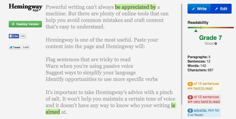
Powerful writing can’t always be appreciated by a machine. But there are plenty of online tools that can help you avoid common mistakes and craft content that’s easy to understand.
Hemingway is one of the most useful. Paste your content into the page and Hemingway will:
- Flag sentences that are tricky to read
- Warn when you’re using passive voice
- Suggest ways to simplify your language
- Identify opportunities to use more specific verbs
It’s important to take Hemingway’s advice with a pinch of salt. It won’t help you maintain a certain tone of voice and it doesn’t have any way to know who your writing is aimed at.
However, it’s one of the most effective ways I’ve found to sanity check articles, blogs posts and other content. File it alongside spelling and grammar checkers as another useful tool to tighten up your writing.
