Make the mundane interesting like Lonely Planet
I’ve been booking a holiday recently and searching lots of sites for deals and discounts. Lonely Planet‘s hotel booking service seems to need a bit of work – it broke more than once while I was using it.
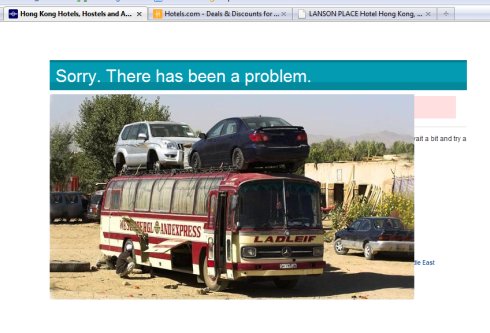
Still, at least when it fell over, it didn’t display a dull generic error message:
 Check it out! It’s a picture of a knackered bus – the type you might get in some the far-flung parts of the world that Lonely Planet can help you visit. (Full size here.)
Ok, never mind that in reality you’re probably just looking for a cheap week in Benidorm. This error page is a great example of how a bit of quirkiness can turn a negative (my hotel search not working) into a bit of a positive (making me chuckle).
It certainly put a bit of a smile on my face, and I’m more likely to give the site another chance as a result.
What could your site do differently to surprise its users?

Leave a Reply