Some locations provide rich pickings when it comes to content strategy done badly. I’ve highlighted planes, trains and automobiles before. But in the last few years, a new poster-child for poor content strategy has emerged.
Have you ever paid attention to the content on the screen of the self-checkout machines in your local supermarket?
They are, almost universally, terrible. Even the simplest of transactions can be peppered with confusing instructions, unhelpful prompts and hard-to-decipher errors.
For example, if we assume that a bagging area is for bags, how can you really classify the bag I’ve put there as a ‘surprising item’? (Morrisons, I’m looking at you.)
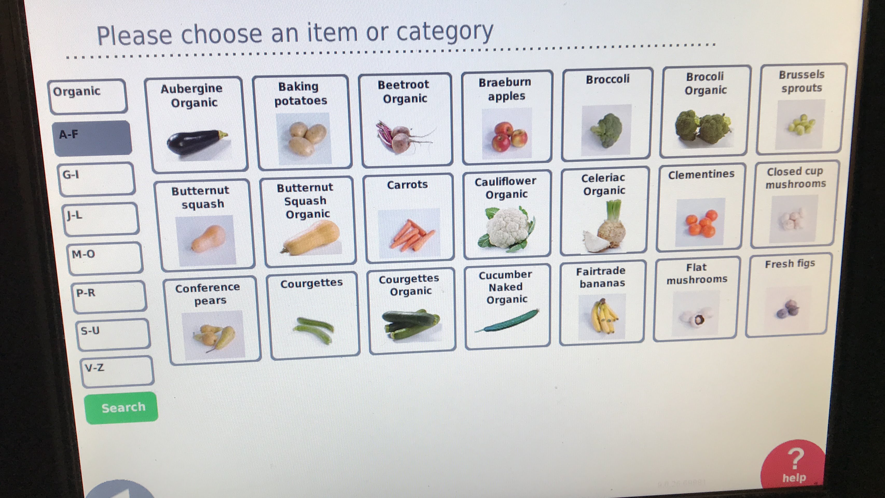
Here’s an example from my local Co-Op. They only sell Fairtrade bananas. That’s no bad thing, but they’re filed under ‘f’ for ‘Fairtrade’ instead of ‘b’ for bananas, which catches me out every time.
And that’s just the start. Even on this single screen, you can see many issues with the content strategy:
- Why is the capitalisation of ‘Butternut squash’ different to ‘Butternut Squash Organic’? What’s so special about the organic option that it merits the initial capitals?
- They’ve spelt ‘broccoli’ wrong, but only for the organic option. I can see how that combination of letters might catch you out, but you’d think a big supermarket chain would get it right.
- Although every single item on this screen is an item of fresh fruit and veg, the figs are the only item specifically identified as ‘fresh’.
- There’s a weird mix of the singular and plural. I can select ‘aubergine’ (single), but ‘baking potatoes’ (plural). What happens if I try to buy just one potato?
None of these things is a disaster. You can still figure out this screen, find the right product and complete your purchase.
But it’s a mess. It’s inconsistent, jarring and unpolished. It feels like a first draft, not like something you’d put in front of your customers. If a cashier serving people in person took the same slapdash approach, customers would leave confused and dissatisfied.
The (lack of) content strategy on this screen makes it harder to navigate – especially if you’re in a busy supermarket with people waiting in line behind you.
Some simple tweaks would improve it, but baking in content strategy from the start would have been better. Because if you can’t find what you’re trying to buy, why use a supermarket self-checkout at all?
The user-friendliness of air travel has been documented before. The confusing nature of boarding passes is just one example of how the world’s airlines could make things a little easier for travellers.
Catching a flight from London City Airport this morning, I spotted another gem.
If your flight is leaving from gate 21, 22, 23 or 24 at London City, you need to pay special attention to where you’re walking. Because this is how those gates are numbered:
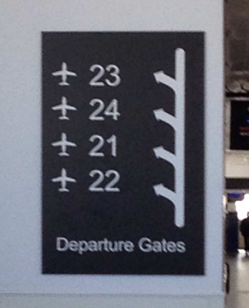
Yes. 22, 21, 24, 23. At City Airport, numbers run in a different order.
This isn’t just another dig at how airports work. It’s a great example of how small details can make the difference between an average experience and a good one.
If you need a sign to explain the order in which thing are numbered, you’re doing it wrong. That sign is equivalent to the sticking plaster copy that clogs up websites because things aren’t sufficiently intuitive.
Or to put it another way: you couldn’t be bothered doing it properly, because it was easier to just explain why it doesn’t work the way people expect.
And yes, these details really matter. Imagine you’re running late for a flight. Your gate — gate 24 — is about to close. Sprinting through departures, you catch a glimpse of a sign: ‘Gates 21 – 24 this way.’
‘Great,’ you think. ‘It’s just typical that my gate would be furthest away.’
As your feet pound the floor, you know it’s going to be tight. Turning a corner, you can see a gate at the end of the corridor.
The sign comes into focus as you approach. It says ’23’. You’ve run right past the gate you needed. And you’ve missed your flight.
I’ve written before about how breaking with convention is a dangerous game. If you’re going to mess with the most fundamental of all conventions — like the order of numbers — you can expect to irritate your users.

If you’ve been paying attention to the world of domain names (come on, who doesn’t?), then you’ll know that waves of new domain extensions are being released onto the market.
If you’re not happy with the usual .co.uk or .com, you can choose .ninja, .doctor, .london, .coffee … or any one of over a thousand other options.
For instance, London’s chain of Nimax theatres can now be found at www.nimaxtheatres.london.
Against this backdrop of new domains, leading travel site Booking.com (note the .com in the company’s name and logo) has launched a TV advertising campaign.
The ad closes with a simple tagline:
Booking.yeah
Planet Earth’s #1 Accommodation Site
Although it seems clever at first glance, this tagline could cause confusion.
As awareness of new domain names becomes more widespread, it’s perfectly conceivable that people could think Booking.yeah is a genuine domain name.
Except that it doesn’t exist. What’s more, it isn’t going to exist any time soon, because .yeah is not on the list of forthcoming domain extensions.
Even more confusingly, Booking.com has applied to run its own .booking domain. (I’m thinking hotels.booking, travel.booking, stuff like that.)
Frankly, with these new domains set to cause some confusion anyway, now seems like a bad time to start inventing non-existent domains just so you can finish your ad with a clever tagline.
But if your company has actually decided to invest time and money applying for its own domain extension, surely you’d think very carefully about what URLs you associate with your brand.