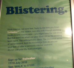
Nice headline. Shame about the rest of the poster.
 Here’s a poster I spotted stuck up in a station the other day. It’s an advert for an Oxfam fundraising event – a 100km, non-stop trek for charity. And I think the headline does the advert proud: “Blistering”.
It makes you want to know more, then as you read the rest of the text, the double meaning (is it about blistered feet, or the speedy pace of your trekking?) makes you smile.
And, of course, it grabs your attention. Or it would, if the dark green text on light green background, badly stuck up rippled paper and dodgy reflection on the glass didn’t render it all but unreadable from distance.
Honestly, what a waste of an excellent piece of copywriting. I get quite annoyed when I see good work treated this way.

Leave a Reply