The user-friendliness of air travel has been documented before. The confusing nature of boarding passes is just one example of how the world’s airlines could make things a little easier for travellers.
Catching a flight from London City Airport this morning, I spotted another gem.
If your flight is leaving from gate 21, 22, 23 or 24 at London City, you need to pay special attention to where you’re walking. Because this is how those gates are numbered:
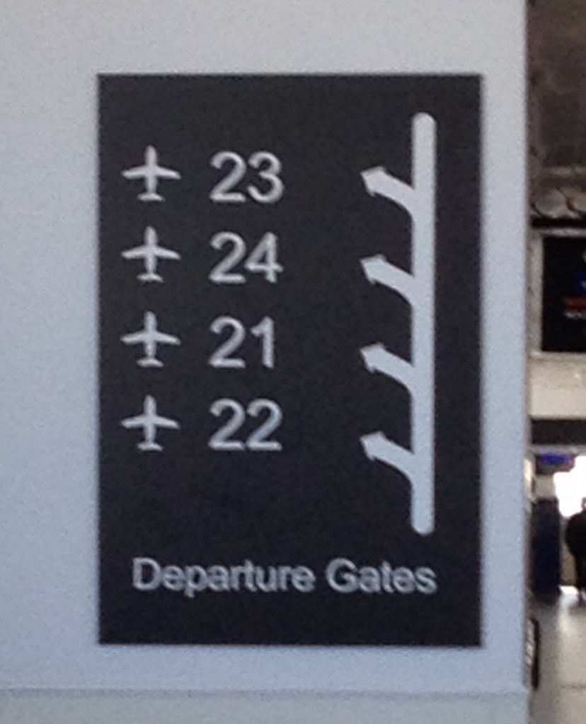
Yes. 22, 21, 24, 23. At City Airport, numbers run in a different order.
This isn’t just another dig at how airports work. It’s a great example of how small details can make the difference between an average experience and a good one.
If you need a sign to explain the order in which thing are numbered, you’re doing it wrong. That sign is equivalent to the sticking plaster copy that clogs up websites because things aren’t sufficiently intuitive.
Or to put it another way: you couldn’t be bothered doing it properly, because it was easier to just explain why it doesn’t work the way people expect.
And yes, these details really matter. Imagine you’re running late for a flight. Your gate — gate 24 — is about to close. Sprinting through departures, you catch a glimpse of a sign: ‘Gates 21 – 24 this way.’
‘Great,’ you think. ‘It’s just typical that my gate would be furthest away.’
As your feet pound the floor, you know it’s going to be tight. Turning a corner, you can see a gate at the end of the corridor.
The sign comes into focus as you approach. It says ’23’. You’ve run right past the gate you needed. And you’ve missed your flight.
I’ve written before about how breaking with convention is a dangerous game. If you’re going to mess with the most fundamental of all conventions — like the order of numbers — you can expect to irritate your users.
Turning a traditional company into an internet-only operation isn’t hard. The hard bit is doing it while managing to still turn a profit.
And while many brands have struggled with the digital world, Auto Trader — one of my regular clients — has adapted impressively.
No more magazines
 The company was once best-known for its weekly magazine full of ads for new and used cars. But the last edition rolled off the presses around a year ago.
Today, the company relies on its website and mobile apps to reach car buyers, sellers and owners.
I can’t claim any credit for that long-term success, of course. But I am pleased that the first Auto Trader project I worked on recently picked up Digital Product of the Year at the British Media Awards.
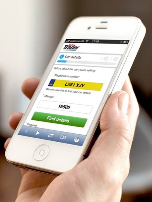
This substantial project was a complete rethink of the way people can advertise their cars through Auto Trader.
The vision was to create a process that would function across desktop and mobile devices, allowing users to switch to the most convenient device at any point.
For instance, if you need to take photos of your car, you can just grab your smart phone and upload them from there.
Simplifying a complex process
Creating an ad for your car is a complex process. You have to enter detailed information, upload images and constantly think about how to show your car in the best light.
I came into the project relatively late on, so most of the credit for the experience should go to the team that worked on it from the start.
However, I did craft virtually all the content in the process, from form labels and error messages to hint and help text. This consistent, friendly copy is designed to help and encourage visitors through the process.
Although very similar, the desktop and mobile experiences are tailored to take advantage of each device’s capabilities. This introduced the challenge of delivering subtly different content while maintaining a consistent, logical experience.
It took a while for everything to come together, but I think the result is a great example of the power of UX content and microcopy.
How did it turn out? You can see for yourself by creating an ad on Auto Trader. But as far as the British Media Awards go, it’s a winner.
Read my case study to learn more about this project.
Now, I’m no expert in running trains, but you might have gathered from previous posts that I’ve had the odd run-in with train company web design, signs and labelling.
In general, it’s fair to say I’m not a fan. And now I’ve found another piece of nasty sticking-plaster copy lurking on the First Great Western website:
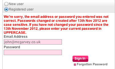
It seems the train company recently made its user password system case sensitive. In terms of security, this is a good move. But to accommodate the change, First Great Western decided to make everyone’s passwords all-uppercase.
If you don’t realise this when you try and sign in, you see this contrived error message:
We’re sorry, the email address or password you entered was not correct. Passwords changed or created after 13th Nov 2012 are case sensitive. If you have not changed your password since the 13th November 2012, please enter your current password in UPPERCASE.
The red text means it look like a serious error message, and it makes the user think they’ve done something wrong.
This is a classic example of a company making a well-intentioned technical change to its website, but forcing users to adapt to this change, rather than taking some extra steps to make life easier for them.
I call it ‘sticking plaster copy’ because it uses lengthy instructional copy to try and patch up the issue rather than fixing it properly.
Essentially, First Great Western has changed my password without asking. That’s inelegant and impolite. (It also raises the question of how securely user passwords are stored, but I’ll leave that issue to the technical experts.)
It makes my interaction with the website more awkward, adding an extra barrier that I have to overcome in order to buy a train ticket.
As an alternative, they could simply have allowed me to sign in as normal, then prompted me to change my password at a later point – perhaps immediately after signing in, or once I’d completed my purchase.
That would have made my life a bit easier, and it might even have positive impact on their website’s conversion rate too.
