
First Great Western’s sticking plaster copy
Now, I’m no expert in running trains, but you might have gathered from previous posts that I’ve had the odd run-in with train company web design, signs and labelling.
In general, it’s fair to say I’m not a fan. And now I’ve found another piece of nasty sticking-plaster copy lurking on the First Great Western website:
It seems the train company recently made its user password system case sensitive. In terms of security, this is a good move. But to accommodate the change, First Great Western decided to make everyone’s passwords all-uppercase.
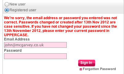
If you don’t realise this when you try and sign in, you see this contrived error message:
We’re sorry, the email address or password you entered was not correct. Passwords changed or created after 13th Nov 2012 are case sensitive. If you have not changed your password since the 13th November 2012, please enter your current password in UPPERCASE.
The red text means it look like a serious error message, and it makes the user think they’ve done something wrong.
This is a classic example of a company making a well-intentioned technical change to its website, but forcing users to adapt to this change, rather than taking some extra steps to make life easier for them.
I call it ‘sticking plaster copy’ because it uses lengthy instructional copy to try and patch up the issue rather than fixing it properly.
Essentially, First Great Western has changed my password without asking. That’s inelegant and impolite. (It also raises the question of how securely user passwords are stored, but I’ll leave that issue to the technical experts.)
It makes my interaction with the website more awkward, adding an extra barrier that I have to overcome in order to buy a train ticket.
As an alternative, they could simply have allowed me to sign in as normal, then prompted me to change my password at a later point – perhaps immediately after signing in, or once I’d completed my purchase.
That would have made my life a bit easier, and it might even have positive impact on their website’s conversion rate too.


