I’ve been booking a holiday recently and searching lots of sites for deals and discounts. Lonely Planet‘s hotel booking service seems to need a bit of work – it broke more than once while I was using it.
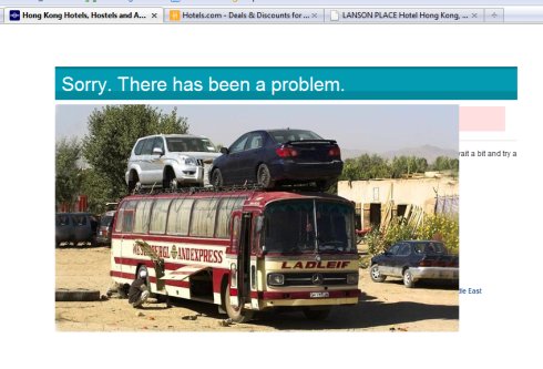
Still, at least when it fell over, it didn’t display a dull generic error message:
 Check it out! It’s a picture of a knackered bus – the type you might get in some the far-flung parts of the world that Lonely Planet can help you visit. (Full size here.)
Ok, never mind that in reality you’re probably just looking for a cheap week in Benidorm. This error page is a great example of how a bit of quirkiness can turn a negative (my hotel search not working) into a bit of a positive (making me chuckle).
It certainly put a bit of a smile on my face, and I’m more likely to give the site another chance as a result.
What could your site do differently to surprise its users?
 I moved house this weekend and hired a car; a tank-like Vauxhall Vectra. Actually, despite having the appearance of a lumbering behemoth, it wasn’t that bad being behind the wheel.
Bizarrely enough though, the car’s indicators got me thinking about how important it can be to conform to people’s expectations.
Conventions abound in virtually every product we use. They make things easy-to-operate and easy-to-understand.
Imagine if every kettle worked in a different way, or if some door handles were postioned on the ‘wrong’ side of the door. Making a coffee would be a nightmare. And each time you opened a door would be a gamble; it might hardly move, or it might fly open and send you crashing through it.
As any web designer worth their salt will tell you, conventions work online too. Following them is a good way to make your website easier to use. Just ask Jakob Nielsen.
Put menus where people expect to find them, make the normal things happen when people click links and using your site will be a less-frustrating, altogether more pleasant experience.
Challenging conventions
Every now and then, a company tries to challenge a tried-and-trusted convention. Just occasionally, they’ll do so successfully; think of the iPod’s click wheel. Why use ‘up’ and ‘down’ buttons to navigate through lists when you can do the same thing faster (and more accurately) with a touch sensitive wheel?
But most of the time, these convention challenges fall flat. The Vectra’s indicators are a fine example – because they work in a different way to virtually every car I’ve ever driven. To turn them on, you push the indicator stalk one way. To turn the indicators off, you push the stalk the same way again.
It’s true that, like most other cars, you can also stop the turn signal by pushing the stalk the other way. But often it doesn’t work well; you simply end up signalling to turn the other way, and then get all confused.
Honestly, I’ve never driven another car like it, and I do apologise to anyone who had to share the Hanger Lane gyratory with me yesterday afternoon. I was trying to go right. Not right-left-right as you might’ve been led to believe.
I’m sure that, given time, you get used to this new way of doing things. But why bother when the old way works just as well?
Because this was a hire car, I was stuck with it for the weekend. However, if it had been a website with a dodgy navigation, I’d have been right out of there.
Clear benefits
Don’t get me wrong: I don’t think challenging convention is always a bad thing. If nobody ever did it, all our vacuum cleaners would still have bags and the world wide web probably wouldn’t even exist.
However, if you do decide to do things differently on your website, remember that you’re asking a lot from your visitors. You’re asking them to learn a whole new behaviour, just for you. Essentially, you’re forcing them to do something different to what comes naturally.
For it to work, there has to be a definite benefit for them. It has to be easier, or faster, or better for some other reason. If it isn’t, don’t do it.
So be careful when you go against convention – or even when you bend it a little. Your great new idea might end up driving visitors away. If you’re running an online business, that could be costly.
Image © GM Corp
I’ve always found Digg an interesting place to kill a few minutes. There’s usually a story or two on the homepage worth a read, usually for amusement value.
A couple of weeks ago I noticed a trend: articles from the Daily Mail seem to make it to the front page quite often. At first glance, the decidedly right-wing tabloid isn’t a natural fit with the social news site, where there aren’t any editors and the combined votes of users determines which stories get most prominence.
But in defiance of that assumption, here are some of the Daily Mail stories that have appeared on the Digg homepage over the past couple of weeks:
There are more – you can search the site to see them.
A skim through the titles does reveal some common elements. The popular stories are frequently about sex, psuedo-science or some sort of miracle cure.
What does this tell us about the Daily Mail? To be honest, not much. I think there’s some truth in the idea that barely a week goes by without the Mail reporting on some miracle cure or hidden danger in something we eat, drink or do. It’s a similar story with sex; the paper’s love of family values and its focus on moral standards ensure that one of its staples is stories involving a person of responsibility being discovered in some sort of compromising or scandalous position. The articles about the teacher and stewardess above are good examples of these.
But has the Mail discovered a new audience in an unexpected place? I think maybe it has. I don’t know whether there’s been any attempt to ‘game’ Digg (rather like last week’s shenanigans involving stories from Times Online), but I doubt it. I reckon it’s just more likely that the type of story which is the Mail’s bread and butter is also the sort that appeals to people on Digg.
The lesson for the rest of us? Well, let’s be honest: it’s hardly rocket science. If you want your story to go hot on Digg, try and write about sex, sciency-sounding stuff and easy cures for common problems or diseases. Quick fixes are good – how to get better at something without having to make too much of an effort. And it won’t hurt if you can find a technology angle and drop in a photo of a young lady in skimpy clothing too.
Accordingly, the next post on this blog will be titled ‘How having sex with computer programmers protects against cancer and makes you a better person’. That should press most of the Digg crowd’s buttons.
 Check it out! It’s a picture of a knackered bus – the type you might get in some the far-flung parts of the world that Lonely Planet can help you visit. (Full size here.)
 I moved house this weekend and hired a car; a tank-like Vauxhall Vectra. Actually, despite having the appearance of a lumbering behemoth, it wasn’t that bad being behind the wheel.