The user-friendliness of air travel has been documented before. The confusing nature of boarding passes is just one example of how the world’s airlines could make things a little easier for travellers.
Catching a flight from London City Airport this morning, I spotted another gem.
If your flight is leaving from gate 21, 22, 23 or 24 at London City, you need to pay special attention to where you’re walking. Because this is how those gates are numbered:
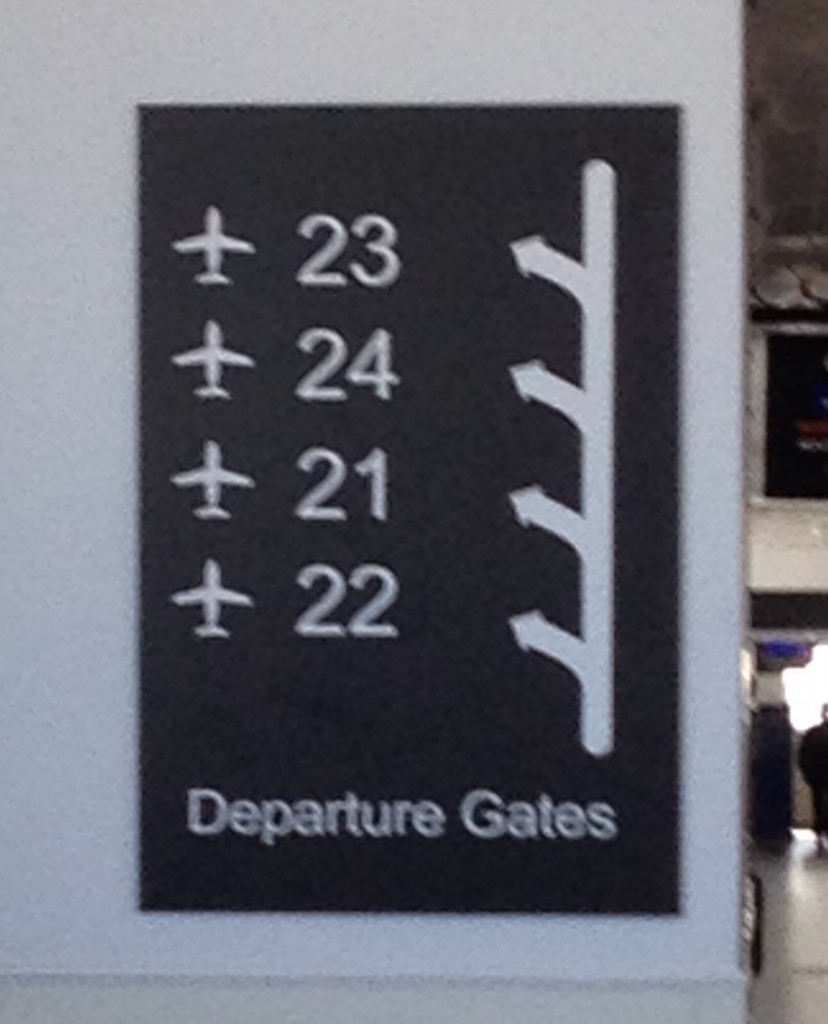
Yes. 22, 21, 24, 23. At City Airport, numbers run in a different order.
This isn’t just another dig at how airports work. It’s a great example of how small details can make the difference between an average experience and a good one.
If you need a sign to explain the order in which thing are numbered, you’re doing it wrong. That sign is equivalent to the sticking plaster copy that clogs up websites because things aren’t sufficiently intuitive.
Or to put it another way: you couldn’t be bothered doing it properly, because it was easier to just explain why it doesn’t work the way people expect.
And yes, these details really matter. Imagine you’re running late for a flight. Your gate — gate 24 — is about to close. Sprinting through departures, you catch a glimpse of a sign: ‘Gates 21 – 24 this way.’
‘Great,’ you think. ‘It’s just typical that my gate would be furthest away.’
As your feet pound the floor, you know it’s going to be tight. Turning a corner, you can see a gate at the end of the corridor.
The sign comes into focus as you approach. It says ’23’. You’ve run right past the gate you needed. And you’ve missed your flight.
I’ve written before about how breaking with convention is a dangerous game. If you’re going to mess with the most fundamental of all conventions — like the order of numbers — you can expect to irritate your users.
Great products and services should delight you the first time you use them. No matter what you’re doing — unboxing your new smart phone, say, or signing up for a Tumblr account — it should be memorable.
That first experience has to be good, because it sets the tone for your ongoing enjoyment of whatever it is you’ve just started using. If it’s bad, you might never use that product or service again.
But if there’s one thing I love more than a great first-use experience, it’s when a product surprises me long after becoming part of my life.
Take my iPhone. My constant companion for three years, I’ve used it for thousands of calls, text messages, emails and tweets.
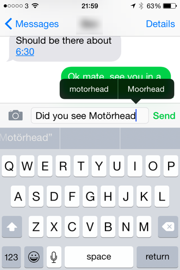
I thought I knew everything there is to know about that handset. But yesterday, I was tapping out a text message about the recently-revealed Glastonbury line-up.
The bands announced include Motörhead, a bunch of British rockers who added an umlaut to their name ‘to look mean’.
As I spelt out their name on my iPhone, the autocorrect function added the umlaut automatically.
I would never expect my smart phone to know how to spell ‘Motörhead’. So when it changed my spelling (I have no idea where to find an umlaut on Apple’s keyboard), the attention to detail made me smile.
It was unexpected. It stopped me in my tracks for a moment, while I realised what it had done. And it made me chuckle.
I don’t think there are many gadgets that would keep surprising me, even after three years. That’s a sign that real care and attention has been put into the user experience.
I’ve said before that I believe copywriters and content creators do their best work when they collaborate closely with designers.
Quite simply, design and content are interdependent. You only get the best final product when you consider them together.
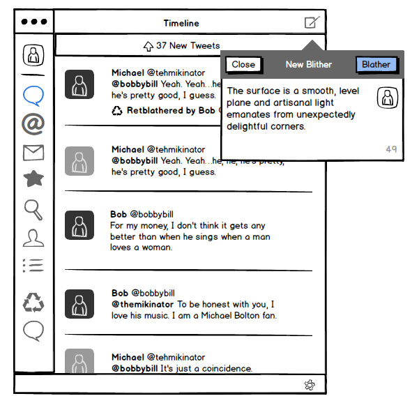
One tool that makes this easier is Balsamiq. It’s a straightforward-yet-powerful piece of software that lets you create rough layouts and low-fidelity wireframes very quickly. Here’s an example:
You can choose from a wide range of design elements, drop them onto your page and arrange as necessary. It’s impressively fast and easy to get the hang of.
Bridging the design gap
Because Balsamiq is so speedy, it can help bridge the gap between writers and designers without introducing unacceptable overheads.
I use it in three main ways:
1. To indicate the relative prominence of content
When I’m working on a content plan, sketching web pages in Balsamiq is a good way to show what content elements should feature and how important they are.
If the final content plan explains the ins and outs of each page, the accompanying Balsamiq mockups provide a quick, visual guide to what content should exist and how visible it should be.
2. To put content in the design early
If I’ve agreed the rough layout of a page with a designer, I’ll knock it together in Balsamiq and drop in my draft content.
This provides context, giving an early indication of whether the content fits the proposed layout. Sometimes, it validates your approach. At other times, it can spark a rethink. Either way, it’s really useful.
3. To save the designer a bit of work
Many designers use Balsamiq to develop web page prototypes at the start of projects.
If so, I can take the prototype and add draft content, providing an altogether more representative view of each design approach without requiring the designer to copy and paste text.
Why unpolished is better
However you use Balsamiq, the resulting mockups look intentionally unpolished. And that means they’re a brilliant way to gather initial feedback without clients thinking ‘this is exactly how it’ll look when it’s finished’.
I’m no designer. But Balsamiq puts basic design tools within my grasp, providing an effective platform to communicate and collaborate with designers.
I purchased it about a year ago so I could work with one client on one particular project. Now, I’d say I use it about every other day. It really is that useful.
Balsamiq is available as an online app ($12+ a month) and as a desktop app for Mac (from $79).
