I went to the Taste Festival in London the other week (if you’re thinking of going next year, it was a collosal, pretentious waste of money).
But one of the companies promoting its wares there was Gü, the people who make those nice puddings you can buy in Sainsbury’s. Not exactly Michelin-starred cuisine, but very nice nonetheless.
I just got around to visiting the company’s website. I was immediately irritated by the gimmicky use of the umlauted ‘ü’ wherever a ‘u’ or ‘you’ would normally suffice. Check this out:
“So over to ü! Just upload ür masterpiece here and get ür friends, family, neighbours, people in the street, long-lost Facebook friends… (ü get the drift!) to vote for ü. Ü can view all the entries in the Gallery and see who’s currently in the Top 5 on the right here.”
Honestly, it’s hurting my eyes just to read that. Stop it. Right now.
I don’t honestly know if the ‘ü’ within the name of the company is an affectation or not (the company website suggests the name’s origins are in Belgium). Either way, the use of the letter like this is quite ridiculous.
I suppose it’s an attempt to be quirky, friendly, and echo the brand throughout the promotional copy. But actually it comes off as clumsy and makes the text less readable because your eyes jolt each time they run into a ‘ü’ in an unexpected place.
I can’t imagine it’s particularly screenreader or search engine friendly either. In all, a big thümbs down.
 I moved house this weekend and hired a car; a tank-like Vauxhall Vectra. Actually, despite having the appearance of a lumbering behemoth, it wasn’t that bad being behind the wheel.
Bizarrely enough though, the car’s indicators got me thinking about how important it can be to conform to people’s expectations.
Conventions abound in virtually every product we use. They make things easy-to-operate and easy-to-understand.
Imagine if every kettle worked in a different way, or if some door handles were postioned on the ‘wrong’ side of the door. Making a coffee would be a nightmare. And each time you opened a door would be a gamble; it might hardly move, or it might fly open and send you crashing through it.
As any web designer worth their salt will tell you, conventions work online too. Following them is a good way to make your website easier to use. Just ask Jakob Nielsen.
Put menus where people expect to find them, make the normal things happen when people click links and using your site will be a less-frustrating, altogether more pleasant experience.
Challenging conventions
Every now and then, a company tries to challenge a tried-and-trusted convention. Just occasionally, they’ll do so successfully; think of the iPod’s click wheel. Why use ‘up’ and ‘down’ buttons to navigate through lists when you can do the same thing faster (and more accurately) with a touch sensitive wheel?
But most of the time, these convention challenges fall flat. The Vectra’s indicators are a fine example – because they work in a different way to virtually every car I’ve ever driven. To turn them on, you push the indicator stalk one way. To turn the indicators off, you push the stalk the same way again.
It’s true that, like most other cars, you can also stop the turn signal by pushing the stalk the other way. But often it doesn’t work well; you simply end up signalling to turn the other way, and then get all confused.
Honestly, I’ve never driven another car like it, and I do apologise to anyone who had to share the Hanger Lane gyratory with me yesterday afternoon. I was trying to go right. Not right-left-right as you might’ve been led to believe.
I’m sure that, given time, you get used to this new way of doing things. But why bother when the old way works just as well?
Because this was a hire car, I was stuck with it for the weekend. However, if it had been a website with a dodgy navigation, I’d have been right out of there.
Clear benefits
Don’t get me wrong: I don’t think challenging convention is always a bad thing. If nobody ever did it, all our vacuum cleaners would still have bags and the world wide web probably wouldn’t even exist.
However, if you do decide to do things differently on your website, remember that you’re asking a lot from your visitors. You’re asking them to learn a whole new behaviour, just for you. Essentially, you’re forcing them to do something different to what comes naturally.
For it to work, there has to be a definite benefit for them. It has to be easier, or faster, or better for some other reason. If it isn’t, don’t do it.
So be careful when you go against convention – or even when you bend it a little. Your great new idea might end up driving visitors away. If you’re running an online business, that could be costly.
Image © GM Corp
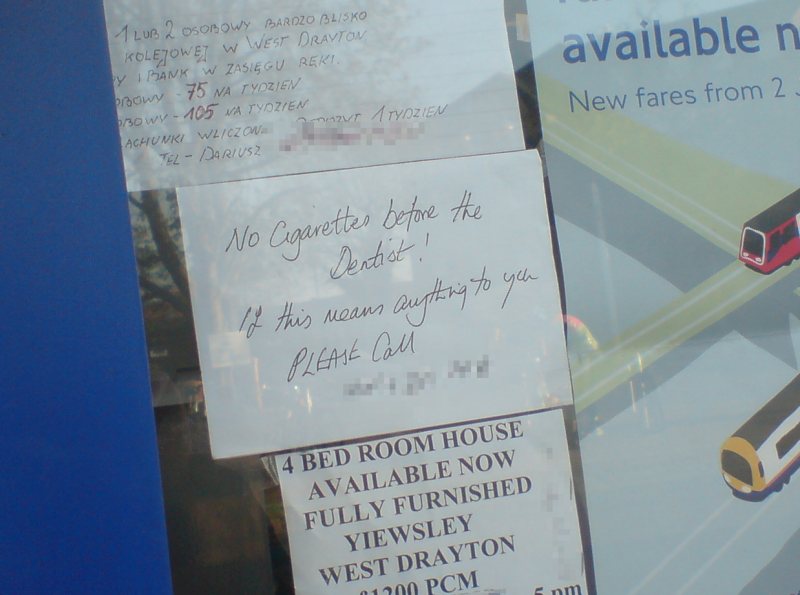
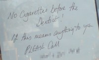 I’ve been running through the photos on my cameraphone this evening and as well as an exciting shot of a Virgin Media van, I found this classic. It’s a small ad – I spotted it in a newsagent’s window in West Drayton the other day:
‘No cigarettes before the Dentist! If this means anything to you, PLEASE call…’
(Full size version here.)
What on earth is that all about? I was half-tempted to call the number, but commonsense prevailed and I haven’t dared.
It doesn’t have much to do with copywriting I know, but did get me scratching my head…
Any suggestions?